
S.W. BASICS
Coco & Co
5 INGREDIENTS OR LESS
5 INGREDIENTS OR LESS
Creative Direction / Packaging / Web Design / Execution
Art Direction / Concept / Photo Art Direction
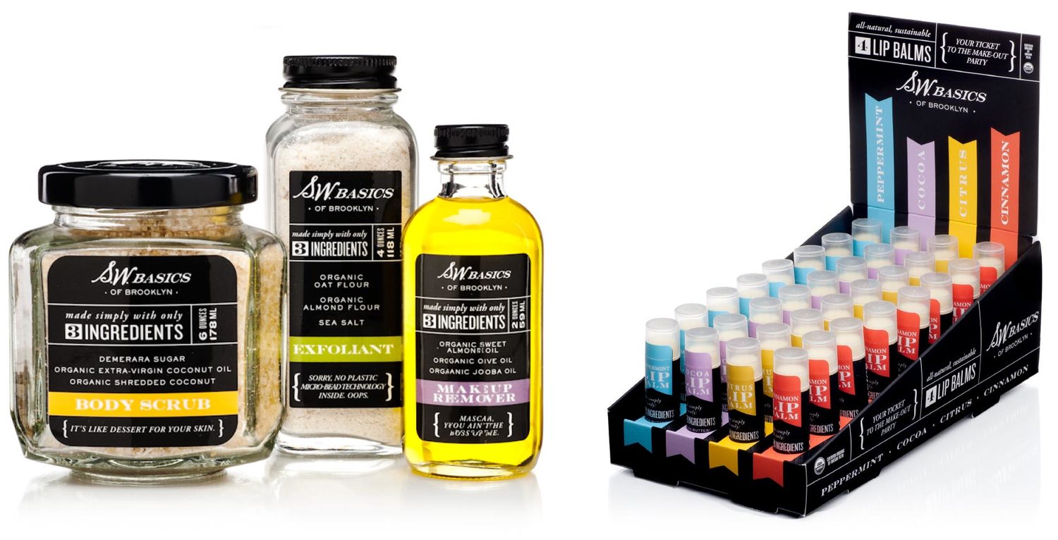
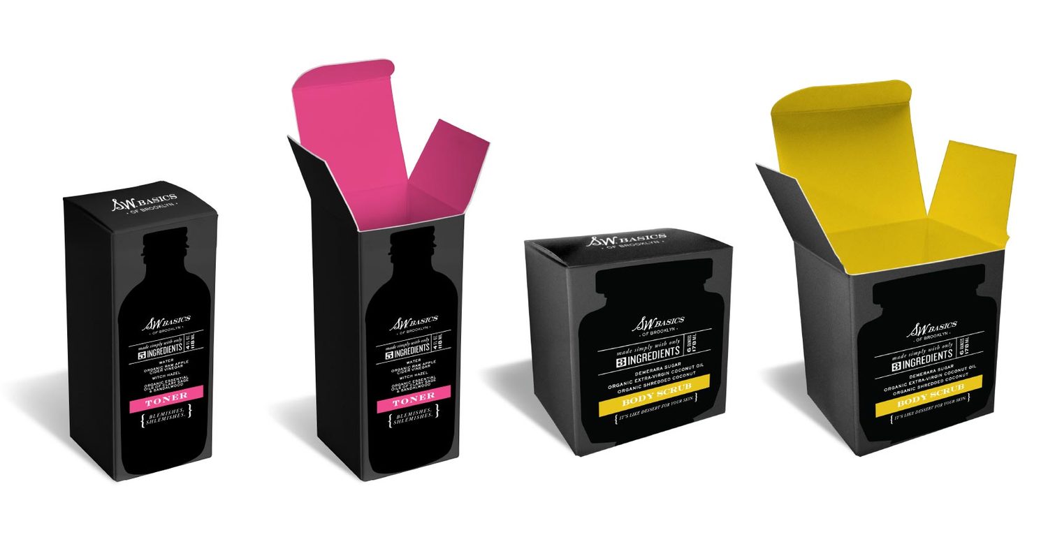
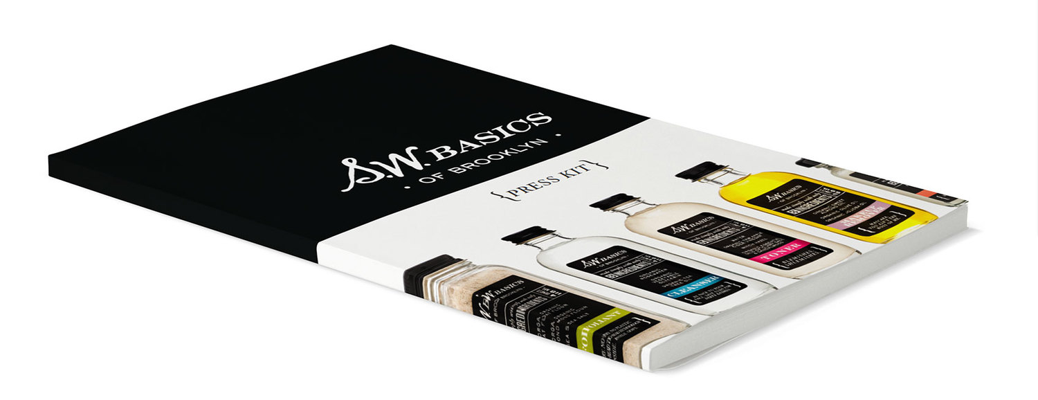
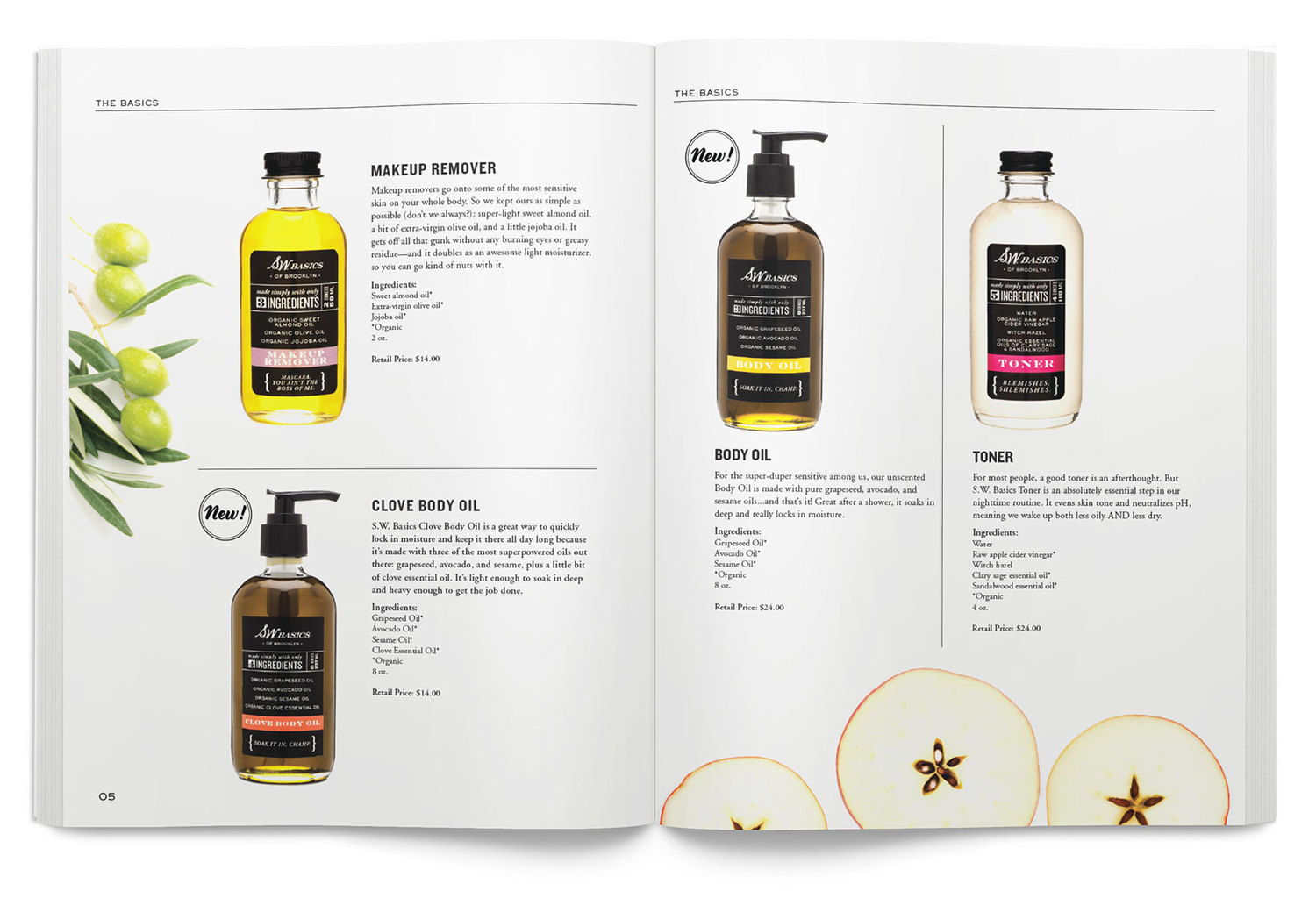
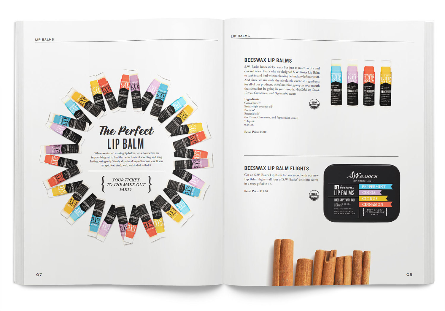
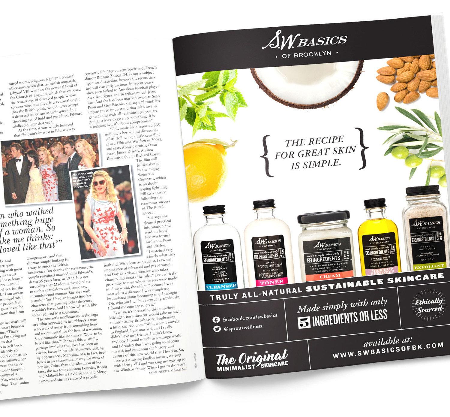
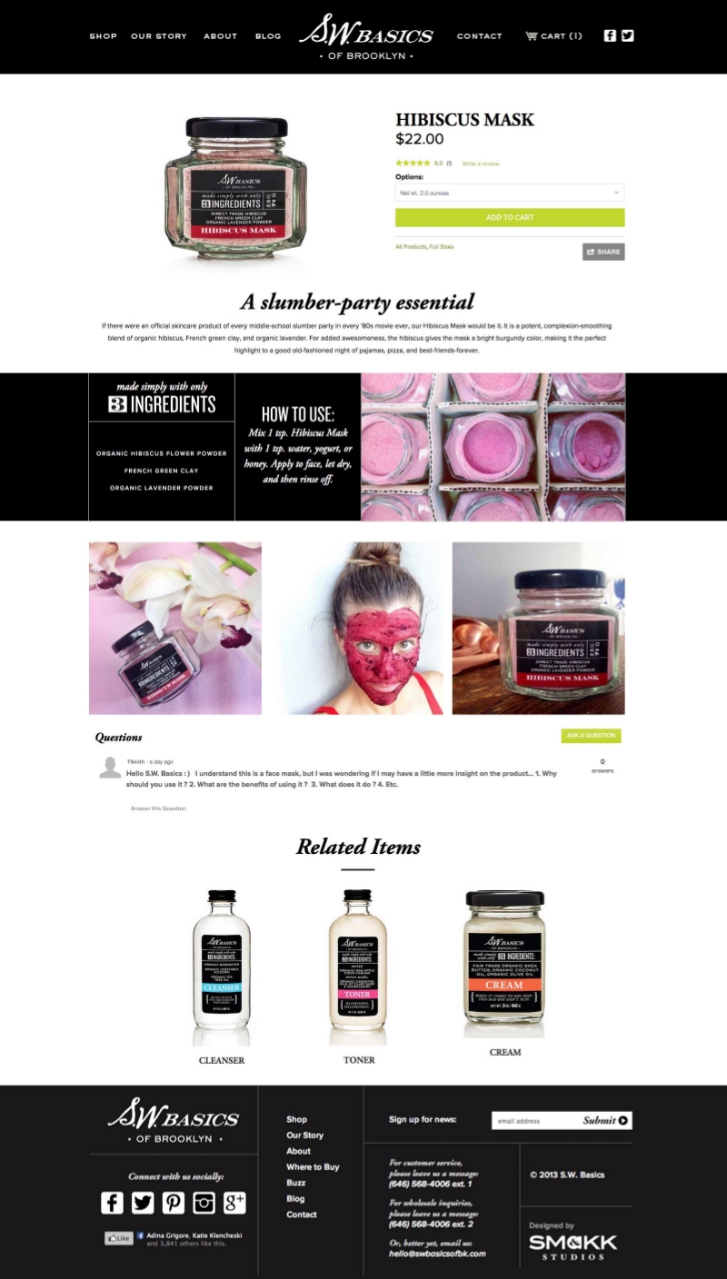
S.W. Basics is a natural skincare company based in Brooklyn, NY. Their philosophy of "Fewer Ingredients = Gentler Skincare" means that all of their products are made with only five ingredients or less. To call this out, I designed all of their packaging to place the number of ingredients front and center. The branding gives a nod to S.W. Basic's homemade, hand-mixed beginnings by drawing on the style and typography of old apothecary and tonic jars. Accents of bright color offset the heavy black grids and featuring funny quotes like "Your ticket to the make-out party" keep the brand feeling modern and very "Brooklyn artisanal". Over my years working on S.W. Basics, I was fortunate enough to design the packaging for all of their products, website, print and digital ads, product displays, and catalog and also see them become a international brand and be sold in over 500 Target stores.
S.W. Basics was originally named "Sprout Wellness" but for legal reasons they had to change their name. We led a naming workshop and landed on S.W. Basics, a name that evokes a corner drugstore while also honors their original name and their commitment to basic, simple ingredients. I created the logo to look like a person's initials and hint at a backstory of an old, family-owned business. The hand-drawn style of the logo harkens back to old apothecary jars.

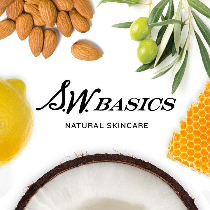
In order to showcase the quality ingredients used in S.W. Basics' products, I created a convention of using simple photography of silhouetted ingredients on a white background.

To justify S.W. Basics mid to high-end prices and compete with luxury skincare brands, the packaging had to feel expensive and beautiful. I used a variety of materials and printing techniques to imbue each product with a sense of luxury while still feeling like a young, fun brand. Some customers save their empty jars and boxes because they think they're too beautiful to throw away—just what a designer wants to hear!

I designed the website to convey the brand’s laid-back island lifestyle, show the different ways to eat the spiced coconut oil, and educate the customer on the quality organic/Fair-trade ingredients.

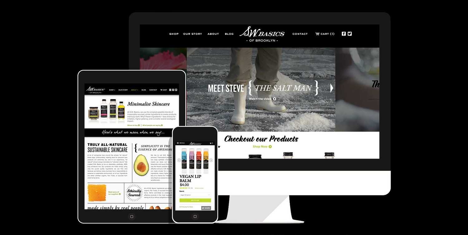
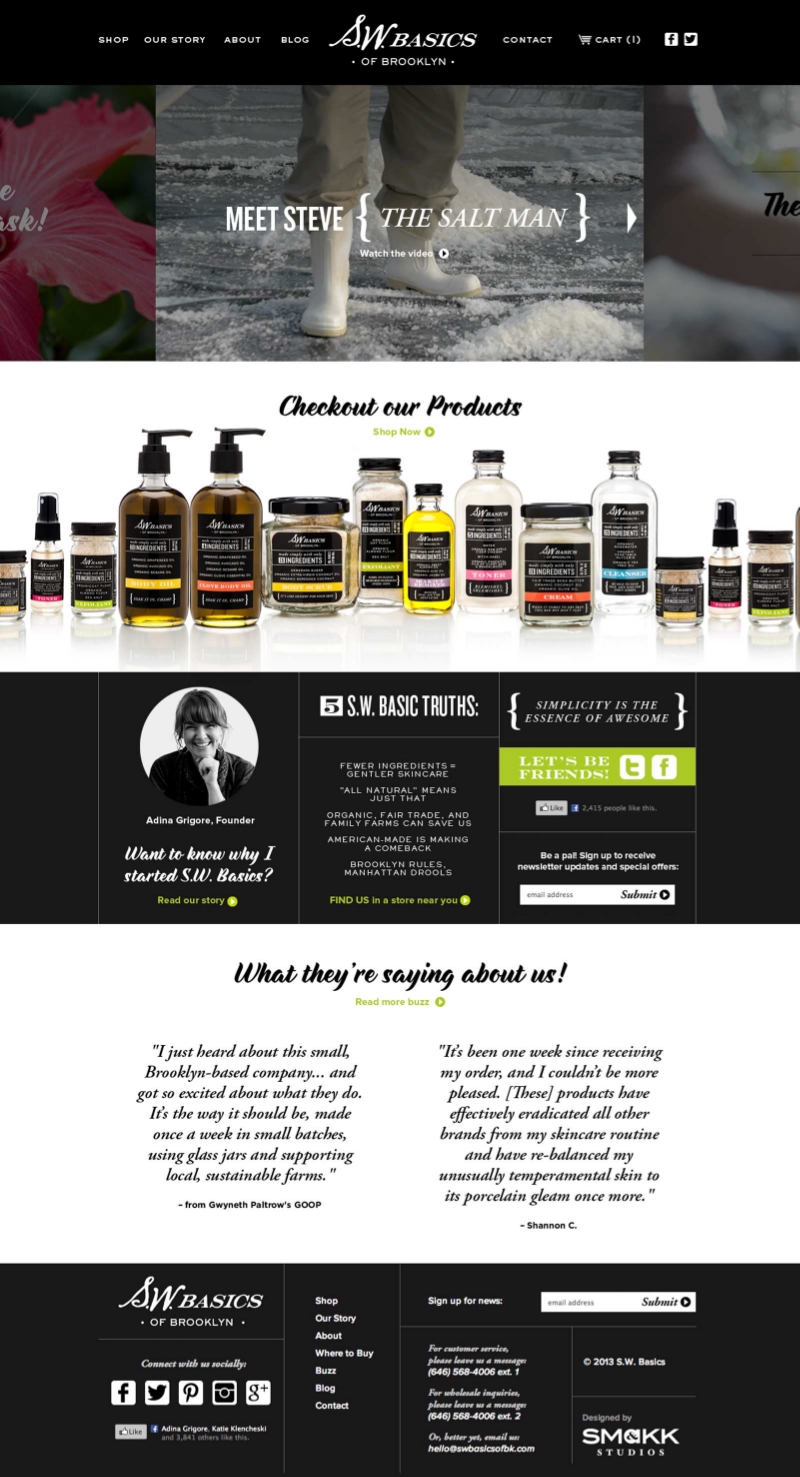
I designed the website not only to showcase the products, but to also convey company founder Adina Grigore's personality and pithy skincare advice. I recently did a redesign of the website's product pages to make them responsive and make them more experiential with how-to videos and customer photos.
Selected Works

GoogleAndroid.com Redesign

David YurmanStyle by the Armful

Alice HopeClothing for the Modern Girl

RockportA New Movement in Footwear
Coco & CoCreamy Coconut Spreads

Nordic EdgeCryotherapy & Modern Wellness

XpresSpaWellness on the Go
S.W. BasicsSkincare with 5 Ingredients or Less

Rite Aid FluDo the Right Thing

BFXThe Boutique Fitness Experience

MD Solar SciencesSerious about Great Skin

Feeding the DragonA Culinary Travelogue through China

SamsungWe Make Solutions